Design Breakdown - Full Circle (Short Film)
I recently came across a really sweet short film site called Rurrux. It’s similar to Netflix, Disney+, and other major streaming platforms, but what sets it apart is its focus on showcasing indie films—a dream come true for someone like me.
After spending a few hours on the site, I discovered the film Full Circle by Yotko. The twist at the end of this 4-minute-and-23-second film left me in awe, and I was inspired to design a poster for it. I’m excited to chat and breakdown how I arrived at the final design.
Note: This Design Breakdown contains spoilers. If you haven’t seen the film, click here to watch Full Circle
Official Synopsis: An assassin on the job realises something's wrong only when it's too late.
Inspiration
Full Circle is a film that draws inspiration from classic noir cinema, and I wanted to reflect that in my design. I also took cues from some of my favourite mafia and gangster films, such as The Godfather, Goodfellas, and Heat. After that, I headed over to Pinterest to start gathering a mood board.
Genre and Tone
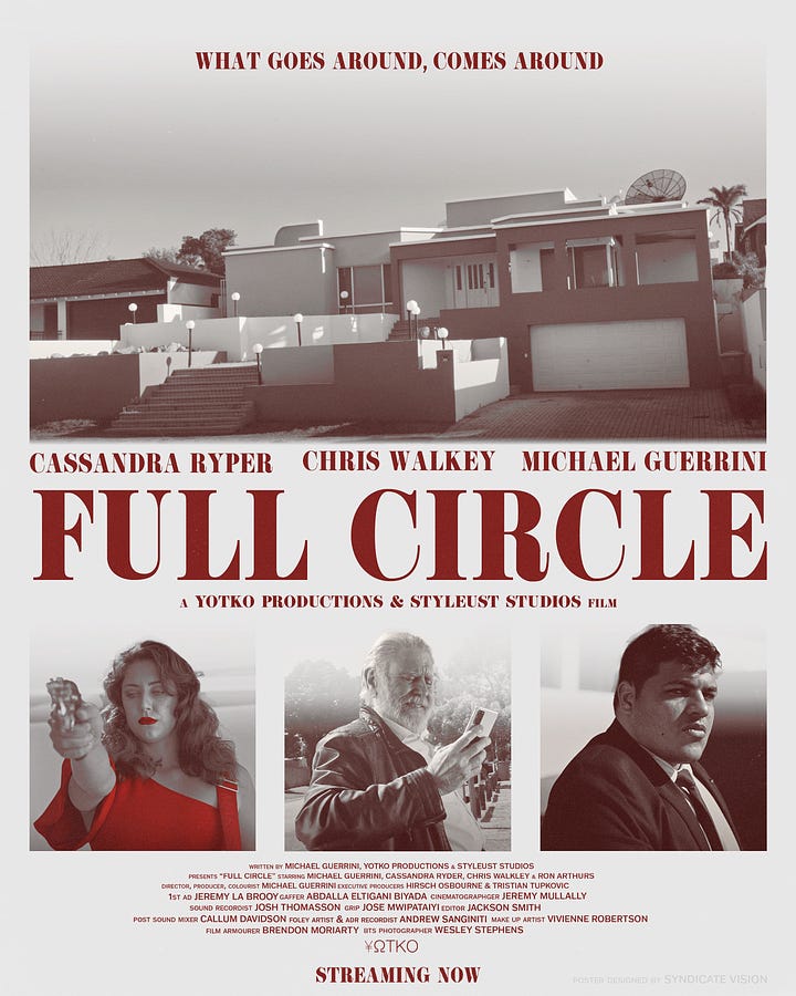
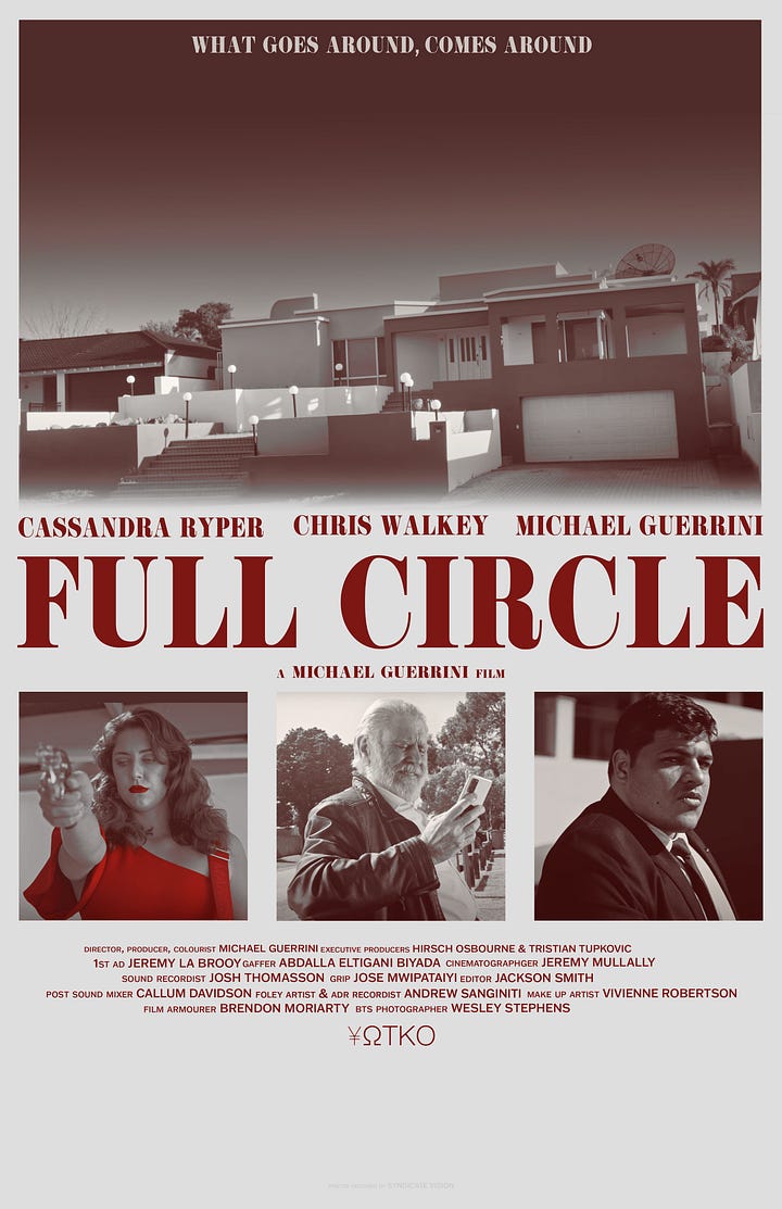
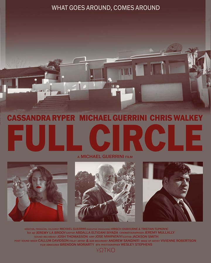
When incorporating elements from mafia movie posters, I wanted to make the main characters and the house the focal points. The house, being crucial to the story, is placed at the top of the poster with a blending effect, guiding the viewer's eyes naturally downward without causing confusion about where to look next.
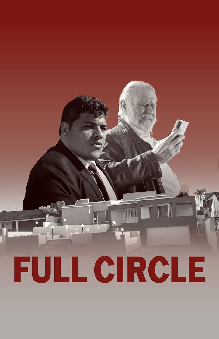
Although the "floating head" design could have been an easy approach, I avoided it since that style has become overly common in recent years
Color Palette
With this being a Noir film and not having much colour to play with. But character that Cassandra plays is seen wearing a red dress & 🚨 Spoiler 🚨 When Micheal’s character ends up getting shot by Cassandra we see blood 🚨 Spoiler 🚨 Using that as the main colour for the text, I then used a very faint red as well to give it more of a pop
Typography
Originally, I planned to use my favourite font, ITC Franklin, but once I placed it on the poster, it looked bland. I didn’t want the design to fall short due to an boring font choice. This is where my Goodfellas inspiration really came into play. I searched for a Blackletter font that closely matched what I wanted to go for, and my goodness, I found the perfect one. As the saying goes, "If it ain't broke, don’t fix it."
Composition and Layout
One of my favourite layouts for movie posters is keeping all the important information centred. This helps the viewer focus without getting confused about the film’s content or plot. Although there are technically four characters in this film, we only see three, so I wanted to feature them on the poster. I experimented with a few ideas, but I’ve always wanted to try the square layout with actors placed inside. I got that inspiration from the Mars Attacks poster, and ever since I was a kid and got into poster design, I’ve been eager to use that concept—and now, here we are (what a perfect spot for inspiration, right?).
Sketch Book/Draft’s
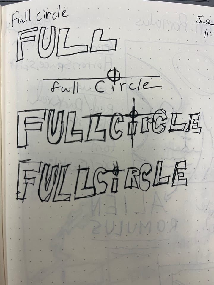
Now that you’ve seen the final posters, how about I pull back the curtain and show some design drafts. Normally I sketch out a rough concept, but for this time around I went straight into photoshop.
I did however try in the early stages to sketch out a title logo, but wasn’t happy how it looked in photoshop. So, I didn’t spend much time trying to refine it. What do you think? Should I have spent more time on it? I think if anything it could’ve been a sweet merch item. Maybe down the road, I’ll revisit the idea

